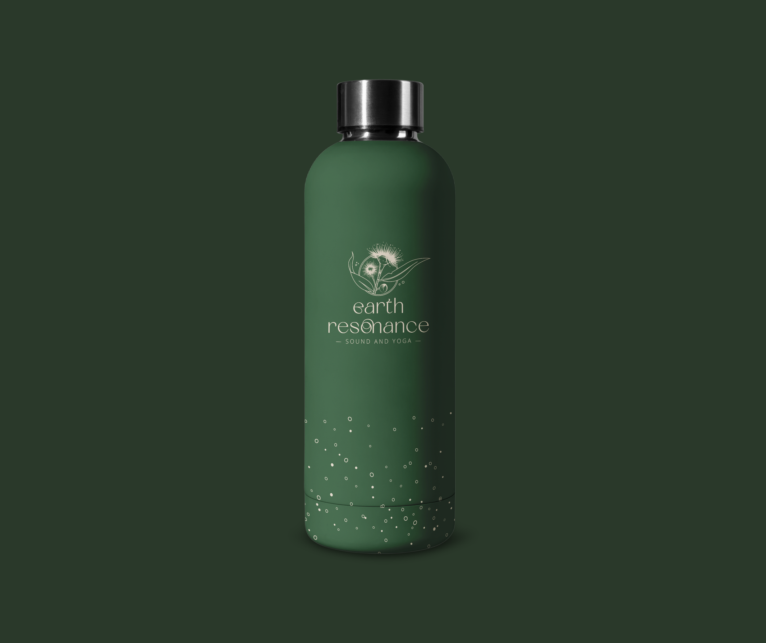
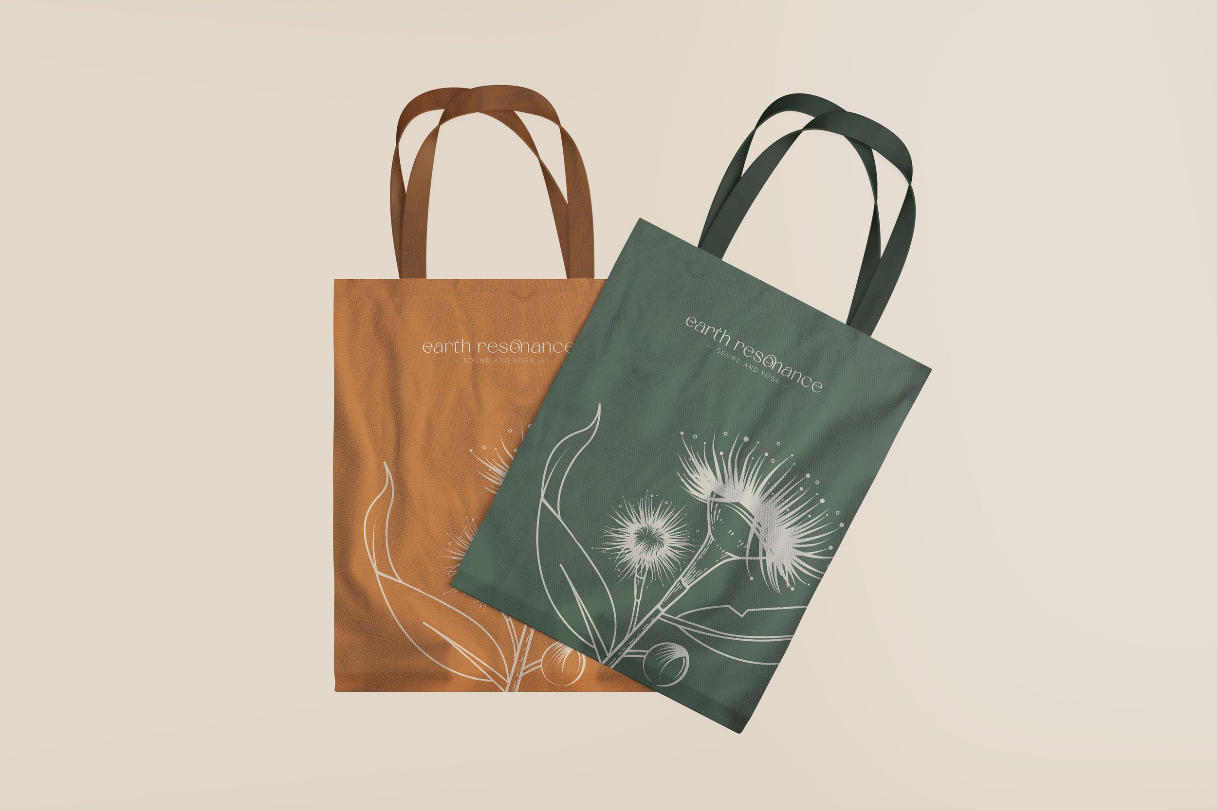
Earth Resonance
Brand design
CLIENT: Earth Resonance
ROLE: Brand/Logo design
Earth Resonance were looking to establish themselves with a new brand identity.
The challenge was to create a visual voice that captured the essence of healing, nature, and warmth.
I designed an illustrative logo that spoke to the beauty of the Australian landscape. The delicate drawing expresses the authenticity of the calming brand. The colour pallet is warm and resembles the earthy tones of the iconic terrain.